Pawsr is a mobile app designed to help pet owners choose products by providing reliable, unbiased information on everything from food to grooming supplies. It simplifies the extensive research process, catering to the increasing awareness and care standards among pet owners,


Overview of the Issue
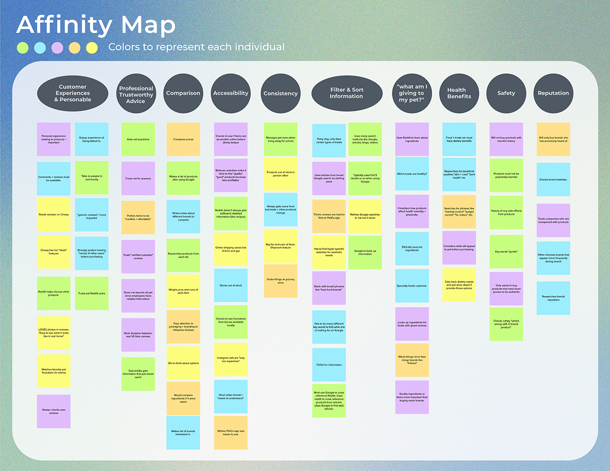
Pet owners often struggle to find reliable, unbiased information that is easy to understand when researching pet products. This is most common when researching food but can also include supplies related to grooming, enrichment, enclosures, etc.
There is an overwhelming amount of information and pet goods online, it can be a difficult task to sift through the information, know which sources to trust, and retain everything all at once.
Why?
Younger generations have become increasingly aware of what they’re consuming (think organic, cruelty free, sustainable). Alongside that, they’re also becoming more aware of what they’re giving to their pets. A phrase that’s been going around with a similar sense is “pets are the new kids & plants are new pets”.
However, interview participants described that it was a lot harder to find products for their pets. Many steps taken were described were long, tedious, and confusing.
User Research
Initial Interviews


Wireframing
Mid-fidelity wireframes were chosen during this process instead of Low-fidelity to ensure a smoother user testing. Establishing basic fonts, copy for user context, and clean layouts in the beginning also assisted me for later when it was time to make high fidelity mockups.
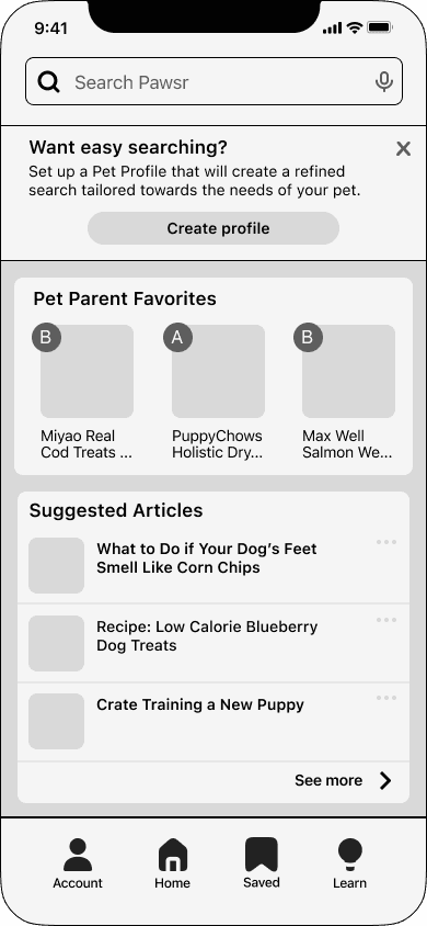
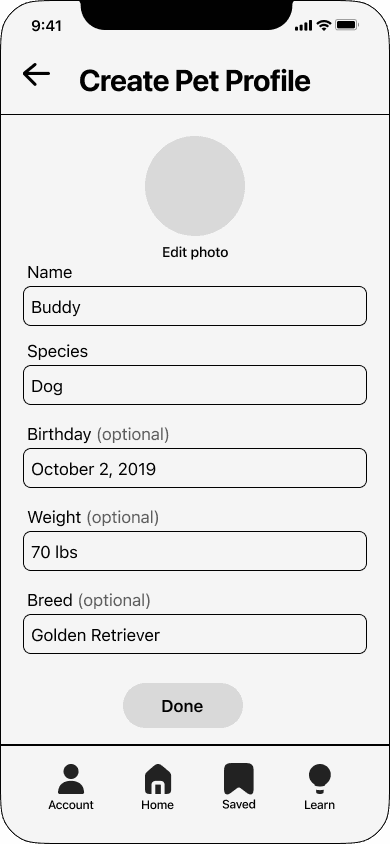

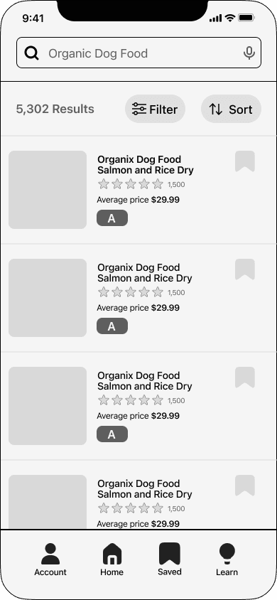


Components & Design

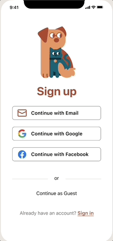
um… orange?
Yes, orange! With its warm and friendly tone, Pawsr fosters a sense of community and supports pet owners in their journey to provide the best care for their furry friends. That's why I felt an orange would best support Pawsr's mission. Teal was chosen to compliment it and offer familiarity in reference to popular pet & shopping apps.
The brand was built around these 3 values: Compassionate, honest, and knowledgeable.
User Testing: What needed fixing?


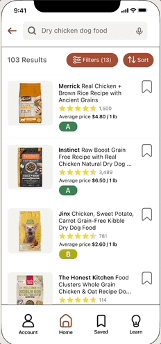
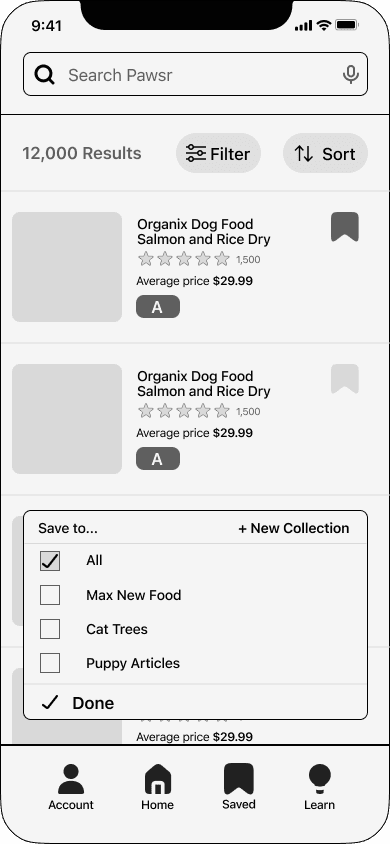
The primary color orange, was being used for multiple different functions. It was brought to my attention users could easily mistake tags for buttons. To improve usability, I utilized the secondary color, teal, to clearly differentiate between these two functions.
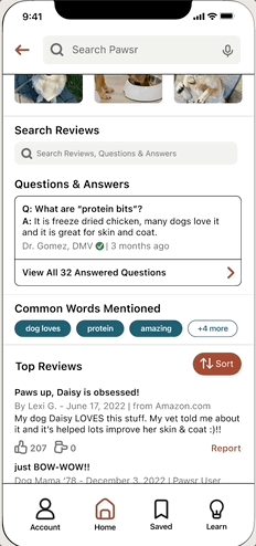
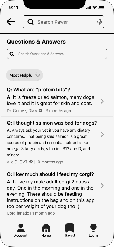
The original button to leave a product review was small and only placed once on its respective page, far into the middle. The button was modified for accessibility as well as design consistency.
A hyperlink was also added to the top of the page for a faster way to add a review. Users responded better when the review button had two locations for ease of access.
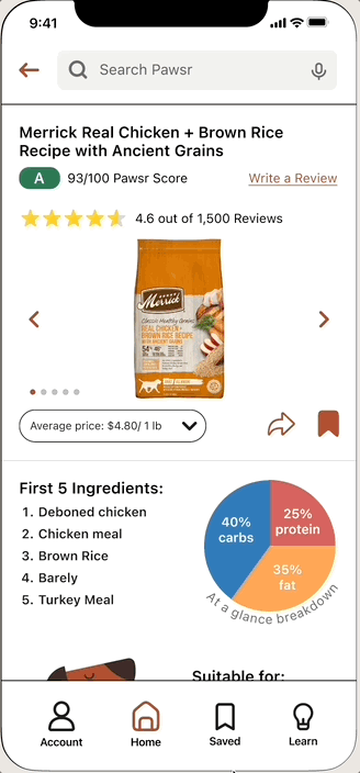


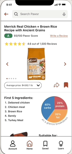
Although users understood the function of the rating breakdown, it did not appear as approachable & interactive as I had hoped. Additionally, the order of each category miscommunicated a sense of hierarchy.
To refine this page I moved breakdowns into their own screen so it didn't feel so overwhelming at a glance. The interactive design was much more approachable to users and info + text no longer felt crammed into a single screen. Additionally, each category was listed as an icon within a diamond shape so it no longer felt like a hierarchy was being pushed onto users. Instead of having to scroll, users may quickly click on what they view most important each time.


While working on Pawsr one challenge I faced was integrating informational articles into a product-focused app. Many apps lately have been integrating multiple features to their interface such as shopping on Instagram, video shorts on Amazon. However it was a struggle for me to find room for articles in a cohesive way rather than them feeling like separate entities. I wanted familiarity.
User testing helped me learn a lot about user expectations and how everything can immediately feel 'off' if components aren't placed exactly where they expect. I had fun researching popular shopping apps to make sure everything seemed consistent with what's being used.
I am excited to have completed such a large project alone (with the help of interviewees of course), and am grateful to have learned so much about researching in the process.